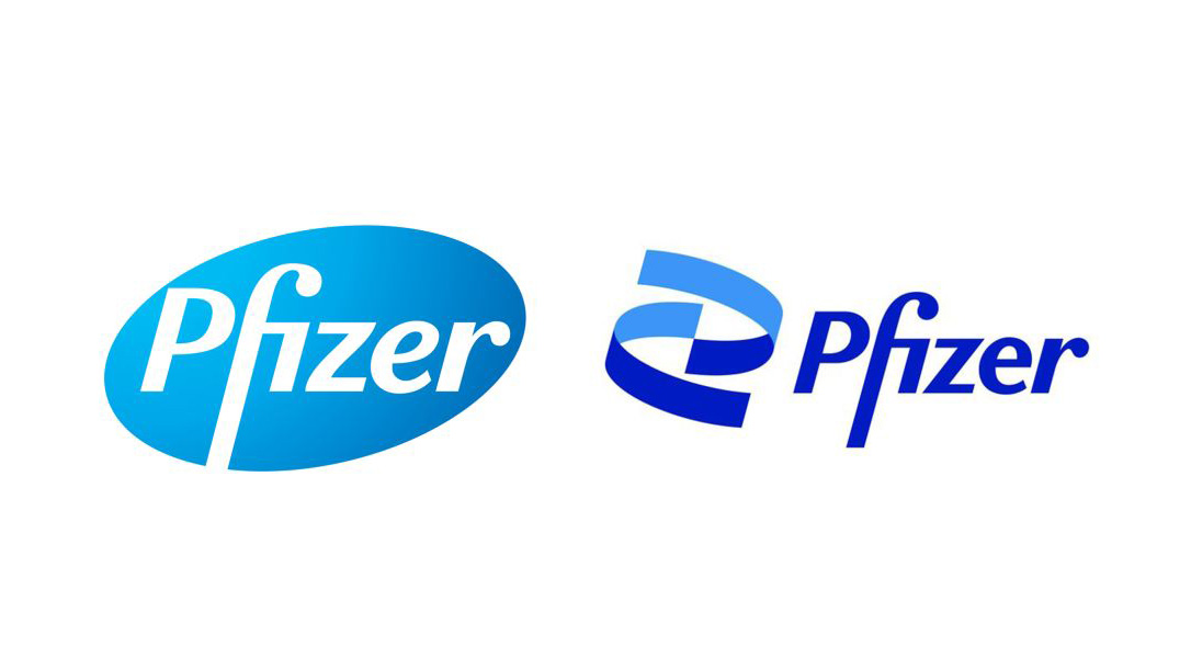
As one of the largest pharmaceutical companies in the world, now more than ever, Pfizer is at the center of attention for the development of the new COVID-19 vaccine with BioNTech. At this pivotal time, after 70 years, they introduced a new identity, welcoming a “new era” according to CEO Albert Bourla. Interestingly, Pfizer admitted that the new rebrand signals a shift from “commerce to science.” Hmmmmm.
Over the past 30 years, the Rappy team has worked on many projects for Pfizer, across various divisions. The logo was always referred to as the “football.” Since 1948, the logotype lived within an ellipse meant to be a pill shape. In 2009 a tilt was added to the shape as well as a gradation to modernize the logo. I remember when a new set of brand guidelines was issued, it felt like a major change. But that was nothing compared to this monumental change.
The new abstracted DNA helix shape, is meant to capture the concept of health, life and well-being. Pfizer says the two-tone blue helix is more representative than the previous pill design of the company’s slogan: Breakthroughs that change patients’ lives. “Pfizer is no longer in the business of just treating diseases,” says Pfizer’s CEO Albert Bourla. “We’re curing and preventing them.”
There are definite improvements in the new design. The wobbly “z” and “e” have been straightened out. Though I do wish they would’ve shortened the descender of the “f” a bit. Although it may not have the immediate recognizability of the standalone logo, they can use the icon as a separate design element both in static and motion uses. I’ve already seen some dynamic 3D twisting and turning of the “ribbons.” Even though they’re safely sticking with the corporate blue, they have evolved to a “vibrant, two-tone palette.”
Overall, I’d have to say the new Pfizer identity does get the job done, albeit not in a particularly earth shattering way. It does feel like a “new era” now that the logotype has been freed up from 70 years of containment. The new logo definitely sets them up for greater flexibility in a digital world that requires a more agile logo design that will work harder than ever.


