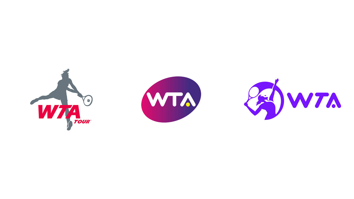
The Women’s Tennis Association (WTA) just launched a new logo, the first redesign in 10 years. (Wow how time flies!) The old WTA logo design was a big departure from the original that featured a silhouette of a female player. It was a stronger mark, but I always found it to be somewhat heavy-handed with the dark color gradation filling the angled ellipse shape which tightly hugged the logotype. Essentially, as a visual identity, it said nothing about the trailblazing, progressive women like Billie Jean King who started the WTA in 1973, almost 48 years ago. The yellow tennis ball serving as the crossbar for the “A” was a nice touch, but overall, the logo seemed off the mark.
The new logo redesign feels more open, spacious and contemporary. The logo includes a rework of the W, T and A letters. It marks a return to a silhouette of a female tennis player. The female player icon strikes a sense of energy and motion. It makes a bold attempt to exude a sense of power as well as agility.
Although the new brand identity retains the tennis ball, it’s no longer yellow. I miss that touch. The font is the same as the old version, which still works, and losing the ligature is definitely an improvement. However, the tilted “T” appears as if it’s trying to escape from between the W and A – it just seems wrong. There is also a lack of a relationship between the icon and the letters. I also question why a second color wasn’t used as an accent – or a connection between the old logo and new one.
Overall, this new logo design has a more vigorous, future-forward attitude. However, the basic drawing and silhouetting choices, as well as scalability, need improvement. I also feel that the illustration could be rendered to feel more inclusive, more diverse, perhaps less “white”?
Overall, I feel the redesign was definitely the right move. It is more contemporary, more active, more engaging, and represents female players. But this new logo still falls short of being a game winner.


